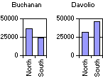
You can create multiple charts in the same PivotChart view to make it easy to compare different aspects of your data. The following example shows multiple charts that compare sales data by using individual charts for each salesperson. The charts in the example also use the same scale, which is optional.
 .
. If you want to use the same axis scale for all charts, click Multiple Plots Unified Scale  .
.
 , and then use the scroll bars and the expand indicators (
 and
and  boxes) to find the field you want to add to the chart.
 If you want to specify the layout of the multiple charts, click Properties  on the PivotChart toolbar, and then click the General tab.
Make sure Chart Workspace is selected in the Select box.
If you select Automatic, the charts will be displayed horizontally or vertically depending on the size and shape of the workspace.