 Add an axis
Add an axis
Click the chart workspace (the blank area between the plot area and the chart boundary).
On the PivotChart toolbar, click Properties  , and then click the Series Groups tab.
Under Series groups, in the Select one or more series box, select the series group for which you want to add an axis.
If you want the axis to reflect a different series, you can group, ungroup, or merge series with other groups.
Under Add axis, in the Groups box, select the group that you want to add the axis for, and then in the Axis position box, select where you want the axis to be displayed.
Click Add.
Remove an axis
Open a datasheet or form in PivotChart view.
Click the axis you want to remove.
Press DELETE.
Change the position of an axis
Open a datasheet or form in PivotChart view.
Click the axis you want to change.
On the PivotChart toolbar, click Properties , and then click the Format tab.
Under Position, in the Position box, select the option you want.
Change the spacing of tick marks and labels on the category axis
Each category on the category axis is identified by a label and separated from other categories by tick marks. You can change the intervals at which labels and tick marks appear, and you can specify where you want the value (y) axis to cross the category (x) axis.
Open a datasheet or form in PivotChart view.
Click the category axis you want to change.
On the PivotChart toolbar, click Properties , and then click the Scale tab.
Change where the category (x) axis crosses the value (y) axis
, and then click the Scale tab. In the Crosses with list, under Crossing Axis, click the axis that you want to cross the category axis.
If you want to specify where the crossing axis should cross the category axis, select the Custom check box and then type a value in the box next to it.
Change a timescale category axis
When your category data is made up of numeric dates, the chart automatically uses a timescale axis. The timescale category axis displays dates in chronological order at specific intervals even if the dates in your data are not in order.
, and then click the Scale tab. None Rather than a timescale axis, use a category axis that uses your dates as text labels.
Auto The chart uses a timescale axis and determines the most appropriate Group size (that is, whether to group dates by days, months, quarters, and so on) for the axis based on your data.
Manual The chart uses a timescale axis, but you determine the most appropriate Group size (that is, whether to group dates by days, months, quarters, and so on) for the axis based on your data.
Reverse the direction of values on an axis
Open a datasheet or form in PivotChart view.
Click the axis for which you want to reverse the direction of values.
On the PivotChart toolbar, click Properties , and then click the Scale tab.
Under Order, select the Show values in reverse order check box.
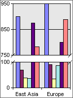
Split values in an axis scale
When you have very low and very high values in your chart, you can split the value axis (or timescale axis) so that all of the values are shown clearly. For example, if your values range from 0 to 950, with values falling between 0 and 100 and between 750 and 950, you can split the axis so that it has two scales: The bottom scale ranges from 0 to 100, and the top scale ranges from 750 to 950, thus eliminating unnecessary chart space between 100 and 750.
, and then click the Axis tab. Change the scale of a value (y) axis
The scale specifies the range of values on an axis, the way the axis values are displayed, the intervals at which the values occur, and the point at which one axis crosses another.
, and then click the Scale tab.