 In PivotTable view
In PivotTable view
 .
.Specify font and style settings
To make the text bold, click Bold  .
.
To make the text italic, click Italic  .
.
To underline the text, click Underline  .
.
To change the text color, click the arrow next to Font Color  , and then click the color you want.
To change the font, click a different font in the Font list.
To change the font size, select a size from the list next to the Font list.
Note The fonts and font sizes available in the lists are determined by the fonts you have installed on your computer.
Align text
Click the alignment you want: Align Left  , Align Center
  , or Align Right
  .
.
Note You cannot change the horizontal alignment of row, column, or filter field labels.
Set background color
Click the arrow next to Fill Color  , and then click the color you want.
Note You cannot set the background color of an entire PivotTable view in one operation. You cannot change the background color of the drop areas.
Change the number format of a field, total, or custom property of a row or column field
Note The number format of a field does not affect the number format of other row, column, filter, or total fields.
In PivotChart View
Rotate or flip the plot area
Open a datasheet or form in PivotChart view.
Click the plot area that you want to change.
On the PivotChart toolbar, click Properties , and then click the General tab.
Do one of the following:
To flip the plot area horizontally or vertically, click Flip Horizontal  or Flip Vertical
  .
.
To rotate the plot area clockwise or counterclockwise in 90-degree increments, click Rotate Clockwise  or Rotate Counterclockwise
  .
.
Change the text size and font for chart items
Open a datasheet or form in PivotChart view.
Click the axis title, data labels, R-squared label and equation label, legend text, chart title, or other chart text that you want to change.
On the PivotChart toolbar, click Properties , and then click the Format tab.
Under Text format, select the options you want.
Change borders and background colors
You can change the border weight and color and the background color for the chart workspace, the plot area, the legend, a single data marker, or a series of data markers.
Open a datasheet or form in PivotChart view.
Select the chart area or item you want to change.
On the PivotChart toolbar, click Properties , and then click the Border/Fill tab.
Do one of the following:
To change the border color, weight, or style, select the options you want under Border.
To change the interior color or fill, select an option under Fill Type (Solid color, Pattern, Gradient, or Picture/Texture) and then select the options you want that pertain to that fill type. For example, if you select Gradient, you can then choose the number of colors in the gradient and the gradient style, or you can choose a preset gradient.
Change line color, weight, and style in chart items
You can change the line weight and color of series lines, axis lines, gridlines, trendlines, error bars, and other types of lines in a chart.
Open a datasheet or form in PivotChart view.
Click the line you want to change.
On the PivotChart toolbar, click Properties , and then click the Line/Marker tab.
Under Line, select the options you want.
Show, hide, or change gridlines
Show or hide gridlines
Open a datasheet or form in PivotChart view.
Click the axis for which you want to show or hide gridlines.
On the PivotChart toolbar, click Properties , and then click the Axis tab.
Under Ticks and Gridlines, select or clear either or both of the Major gridlines and Minor gridlines check boxes.
Change gridlines
Open a datasheet or form in PivotChart view.
Click the gridlines you want to change.
On the PivotChart toolbar, click Properties , and then click the Line/Marker tab.
Under Line, select the options you want.
Add a picture or textured fill to a chart item
Open a datasheet or form in PivotChart view.
Select the chart area or item to which you want to add a picture ù for example, the chart workspace, the plot area, or a data marker.
On the PivotChart toolbar, click Properties , and then click the Border/Fill tab.
Under Fill, in the Fill Type list, click Picture/Texture.
Do one of the following:
Add your own picture
Click URL and type the location and name of the image you want to use.
For location, you can use a Web address starting with a valid protocol such as:
http://www.microsoft.com/images/image_name.gif
or a UNC path such as:
\\server\folder\image_name.gif
or a path to a file on your hard drive, such as:
C:\image_image.gif
Press ENTER.
Next to Format, click an option for how you want the picture to appear in the chart.
Tile Tiles the image to fill the selected space.
Stretch Stretches the image to fill the selected space.
Stack Stacks the image to fill the selected space.
Stack scale Stacks the image according to the number of value axis units you specify in the units box. For example, if a data marker in a column chart measures $6,000 on the value axis, and you specify units to represent $1,000, six images would be stacked in the data marker.
Stretch plot Stretches the image across the entire chart, but fills only the selected item or items.
If you chose Stack scale, type the units you want each image to fill in the units box, and press ENTER.
Add a built-in texture
Click Preset and click the texture you want to use in the Preset list.
Change the view of a 3-D chart
Open a datasheet or form in PivotChart view.
On the PivotChart toolbar, click Properties , and then click the General tab.
Under General commands, click Chart Workspace in the Select box.
Click the 3D View tab.
Click the Projection mode you want.
Perspective  Chart objects are represented in relative distance and positions as they might appear to the eye.
Orthographic  Chart objects are represented as if they all appear on the same plane, on a surface that is perpendicular to both the view and the lines of projection.
Make the changes you want by dragging the sliders for each option. For example, to rotate the lighting source for the chart, drag the the rotation slider  under Lighting.
Notes
To return to the default view of the chart, click Default  next to Default view.
To make the height ratio or depth ratio proportionate, select the Height Ratio or Depth Ratio check box.
Map chart colors to distinguish ranges of data
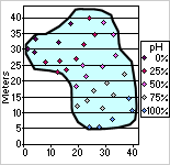
You can format data markers so that graduated or solid colors represent values or ranges of data. For example, the following chart shows locations of water samples and corresponding pH measurements distinguished by graduated colors, where higher percentages of pH levels are represented by increasingly lighter colors.
Open a datasheet or form in PivotChart view.
Click a data marker within the data series you want to format; then click again to select the entire data series.
On the PivotChart toolbar, click Properties , and then click the Conditional Format tab.
Select the Conditionally color data points check box.
In the Style list, click the style of conditional formatting you want.
Three Point Gradient Uses three graduated colors to distinguish between the smallest value and zero (or the value you indicate) and between zero (or the value you indicate) and the largest value.
Two Point Gradient Uses two graduated colors to distinguish between smallest and largest values.
Two Segment Solid Uses two solid colors to distinguish between values smaller than zero (or the value you indicate) and larger than zero (or the value you indicate).
Bottom Values Uses a solid color to distinguish the smallest values in a range.
Top Values Uses a solid color to distinguish the largest values in a range.
Next to Colors, choose the Beginning Color, Middle Color, or End Color (where applicable) to represent value ranges.
If you want to indicate a value on which to base your conditional format, type that value in the Value box and select the % check box if appropriate. For example, to format the top 90% of values, type 90 in the value box and then select the % check box.
Pull out slices in pie or doughnut charts

In doughnut and stacked pie charts, you can pull out slices in the outer ring only.
Open a datasheet or form in PivotChart view.
Do one of the following:
To pull out all slices or rings, click the chart workspace (the blank area between the plot area and the chart boundary).
To pull out one slice or ring, click the data slice or ring.
On the PivotChart toolbar, click Properties , and then click the General tab.
Under Chart, in the Explosion box, type a number to represent ù as a percentage of the radius ù the distance between the point of the slice or slices and the center of the doughnut or pie.
Rotate the position of the slices in a doughnut or pie chart
The order in which data series are plotted in pie and doughnut charts is determined by the order of the source data. Use this procedure to rotate slices within the 360 degrees of the pie or doughnut circle.
Open a datasheet or form in PivotChart view.
On the PivotChart toolbar, click Properties , and then click the General tab.
In the Select list, click Chart Workspace.
Under Chart, in the Angle of first slice box, type a number between 0 and 360 to specify the angle at which you want the first slice to appear.
Change the overlap or spacing of data markers in bar and column charts
Open a datasheet or form in PivotChart view.
Click the chart workspace (the blank area between the plot area and the chart boundary).
On the PivotChart toolbar, click Properties , and then click the General tab.
Do one of the following:
To change the overlap of the data markers in each category, type a number between û100 and 100 in the Overlap box to represent the percentage of overlap you want. For example, at 100, bars or columns overlap each other, while at û100, a bar or column width of space is displayed between each. At 0, bars or columns are adjacent to each other.
To change the spacing between categories of data markers, type a number between 0 and 500 in the Gap width box to represent the percentage of gap width you want. For example, at 0, data markers touch; at 100, there is one bar or column width of space between each.