This article was originally published on Aug. 30, 1996. Author: Jason M. Perry 608 Amber Way Virginia Beach, VA 234 62 E-Mail: jmperry@erols.com
A lot of people have asked, "How do I create a button other than a square one?"
If any of you have sub-classed the various button controls and tried to override the DrawButtonFace / DrawItem methods, you know that this can be a immense pain. When I started out designing a custom shaped button, I went to the object hierarchy and started at TButton then went up the tree until I hit a class that had all of the basic properties and methods that I needed to put it together: TGraphicControl.
TGraphicControl has only one published property, a canvas property. It is what allows you to draw the picture of the button. It also has the only necessary methods to do the job: create, destroy, and paint. The create and destroy you already know about. However the paint method is how you make it work. The virtual paint method responds to WM_PAINT Windows messages. I override this method and draw the button to look and respond the way I want it to. For instance, when you click the mouse button, you want the button to appear to get 'pushed'. When you release the button, you want it to 'come back out'. All this is handled through the Paint method.
In addition to getting the graphics right, a button is worthless without a click event. So I created an OnClick event by trapping the Windows messages WM_LButtonDown and WM_LButtonUp messages. Lets get into a little more detail on how to get this done.
A good place to start is to define what you actually want it to do. For the sake of the article, we'll keep it pretty basic but involved enough to teach some key principles. Let's put a caption on it, give it a face color, and most importantly a click event. In addition, there are several properties that I can just declare in the published section that automatically happen for TGraphicControl such as enabled, hint, visible, and font (Listing 1).
Listing 1.  Object TRoundButton declaration.

unit RoundButton;

interface
uses Windows, Messages, Controls, Graphics,   Classes;

type
  TRoundButton = class(TGraphicControl)
  private
    // Caption field.
    fCaption : String;
    // Color of the button face.
    fButtonColor : TColor;
    // Is the button down?
    LButtonDown : boolean;
    // Points describing the rectangle
    // in which the circle is inscribed.
    aBtnPoints : array[1..2] of TPoint;
    // Region variable for freeing the
    // region that was drawn and trapping
    // the windows messages.
    KRgn : HRgn;
    procedure SetCaption(value: String);
    procedure SetButtonColor(value: TColor);
    procedure FreeRegion;
  protected
    // The procedure that lets us do it!
    procedure Paint; override;
    // This procedure actually does
    // the drawing of the button.
    procedure DrawCircle;
    // Procedure that redraws the button
    // in up or down mode.
    procedure MoveButton;
    // The windows messages that I trap.
    procedure WMLButtonDown(var Message:
       TWMLButtonDown); message WM_LBUTTONDOWN;
    procedure WMLButtonUp(var Message:
       TWMLButtonUp); message WM_LBUTTONUP;
  public
    constructor Create(AOwner: TComponent);
override;
    destructor Destroy; override;
  published
    property ButtonColor: TColor read
 fButtonColor write SetButtonColor;
    property Caption: String read fCaption write
 SetCaption;
    property Enabled;     // These are just
    property Font;        // a normal part
    property ParentFont;  // of TGraphicControl.
    property ParentShowHint; // So just declare
    property ShowHint;       // them here to
    property Visible;  // have access to them.
    property OnClick;  // This requires that a
  end;                 // windows message be
                       // trapped.
procedure Register;
|
The face color is pretty easy. First, I declared a private field named fButtonColor of type TColor (Listing 1). The 'f' doesn't really mean anything, it is just good style to show the type of the variable you are naming. TColor is an enumerated type, so it automatically creates the cool drop down combo in the object inspector with the list of colors in it.
Now declare the property in the published section as ButtonColor. This property won't need a read method so you and read directly from fButtonColor, however it will need a private method named SetButtonColor (Listing 1) to set the color of the button. You could just write it to the field, but if you want to change the color at runtime, you will have to repaint the control with the new color. So, in the SetButtonColor method, you set the field value to the new one, then call the Invalidate method (Listing 2). This forces the control to repaint as soon as possible.
Now, if you change the ButtonColor at runtime, say based on some condition, it will repaint immediately and will reflect the new color. Cool, huh?
Listing 2.  The SetButtonColor Procedure.

procedure TRoundButton.SetButtonColor
                     (value: TColor);
begin
  // Only change the value if it is
  // different from the one already
  // in the fButtonColor field.
  if value <> fButtonColor then
    begin
      // Set the value.
      fButtonColor := value;
      // Forces the control to repaint
      // as soon as possible.
      invalidate;
    end;
end;
|
The caption property is about the same. It has a private variable named fCaption of type string. It also can be read directly from the field and needs a 'Set' method for the same reasons. The difference is that the SetCaption method is a little more complex.
First you write the new caption to the fCaption field as you normally would. Next, set the font name, color, and style of the canvas to the same ones of the control (Listing 3). At this point, I check to see if the button is enabled or not. If it is, I set the color to the one that the control has stored. If not, I set it to dark gray, to give it the 'disabled' look. You can do all kinds of tricks here like shadow the caption in order to make it look just like the Delphi buttons, but I didn't.
Finally, I did some math and centered the caption based on the width and height of the text. Check out the canvas property. It has bunches of things you can use to do some radical graphics. Real simple stuff.
Listing 3.  The SetCaption Procedure.

procedure TRoundButton.SetCaption
                (value : String);
var
  x, y : Integer;
begin
  // Write the button caption.
  if ((value <> fCaption) and
     (value <> '')) then begin
    fCaption := value;
  end;

  With Canvas.Font do begin
    Name  := Font.Name;
    Size  := Font.Size;
    Style := Font.Style;
    // Check if the button is
    // enabled or not.  If not, gray
    // the text out to give it the
    // 'disabled look'.
    if Self.Enabled then
      Color := Font.Color
    else
      Color := clDkGray;
  end;

  // Center the caption on the button.
  // It would not be hard to create a
  // 'justify' property here to that
  // you could left and right justify
  // the caption as well.  Think about
  // using and enumerated type called
  // Justify.
  x := (Width div 2) -
       (Canvas.TextWidth(fCaption) div 2);
  y := (Height div 2) -
       (Canvas.TextHeight(fCaption) div 2);
  // Write out the caption to the canvas.
  Canvas.TextOut(x, y, fCaption);
  Invalidate;
end;
|
The last thing to do in the basic setup is trap the Windows messages that are necessary to make the OnClick event run.
Windows messages are real easy to understand. Just declare the procedure and when Windows sends a message, such as WM_LBUTTONDOWN to the control, the method name you declared runs. So that I could keep track of whether the button is down or up, I declared a private variable named lButtonDown as type boolean (Listing 1). When I click down, it is set to true and when I release, it is set to false (Listing 4). This is where the button appears to get pressed. The message method calls a method named MoveButton. Depending on the value of lButtonDown, I draw the button in 'up' or 'down' position.
There are all kinds of neat things you can do with Windows messages. I plan to write an article on them so keep your eyes peeled.
Listing 4.  Trapping the Windows Messages.

procedure TRoundButton.WMLButtonDown(var
       Message: TWMLButtonDown);
begin
  // Make appear sunken when
  // mouse button pushed.
  if not PtInRegion(kRgn, Message.xPos,
               Message.yPos) then Exit;
  // Set the lButtonDown variable to true.
  // This lets us check anywhere in
  // the program on the state of
  // the button.
  lButtonDown := True;
  // Run the procedure that makes
  // the button appear to move.
  MoveButton;
  // Inherit the rest of the normal
  // message stuff.
  inherited;
end;

procedure TRoundButton.WMLButtonUp
          (var Message: TWMLButtonUp);
begin
  if not lButtonDown then Exit;
  lButtonDown := False;
  MoveButton;
  inherited;
end;
|
Now I get into the nitty gritty (just what does "nitty gritty" look like anyway?).
Notice in the create method (Listing 5) that the ControlStyle property gets set to [csClickEvents, csCaptureMouse]. The csCaptureMouse parameter says that the control captures mouse events and the csClickEvents says that the control can receive and respond to mouse clicks. Without these, your mouse doesn't work.
If you take the time to look up the TControlStyle type you will see several other very cool possibilities. Now notice the kRgn := 0;. It is of type HRgn which is a Windows handle to the region that the component covers. This region is what receives the Windows messages (once it have been created). Since it takes up resources, you must free the region on Destroy using DeleteObject. There is one other place that you want to free the region, on Paint of the control. I did this so that the whole button was refreshed every time it was painted. The rest of the code just sets some 'drop on the form' defaults.
Listing 5.  The Create and Destroy Methods.

constructor TRoundButton.Create
           (AOwner: TComponent);
begin
  inherited Create(AOwner);
  // This is very important! The
  // ControlStyle property is a
  // set of style flags that indicate
  // whether the control captures
  // mouse events or not (among others).
  ControlStyle :=
      [csClickEvents, csCaptureMouse];
  // Just set some 'drop on the form'
  // default values.
  Width := 50;
  Height := 50;
  fButtonColor := clBtnFace;
  kRgn := 0;
  lButtonDown := False;
end;

destructor TRoundButton.Destroy;
begin
  if kRgn <> 0 then
    FreeRegion;
  inherited Destroy;
end;

procedure TRoundButton.FreeRegion;
begin
  // If the region has been created,
  // then you can free it.
  if kRgn <> 0 then
    // DeleteObject frees all
    // resources for the object.
    DeleteObject(kRgn);
  // Set it back to zero because
  // the DeleteObject also makes
  // the handle invalid.
  kRgn := 0;
end;
|
Here comes the whole trick to getting the custom shape and '3d' look of the button. It all starts by overriding the Paint method of TGraphicControl (Listing 1). The Paint method naturally calls 'inherited' first. Next it frees the region kRgn that I defined. This keeps the 'garbage' off of the screen during re-paints. Finally, it calls the DrawCircle method (Listing 6).
Listing 6.  The Paint Method and DrawCircle Method.

procedure TRoundButton.Paint;
begin
  // Get the normal paint stuff.
  inherited Paint;
  // Free it first.
  FreeRegion;
  // Now create and draw the circle.
DrawCircle;
end;

procedure TRoundButton.DrawCircle;
begin
  {
  (iOffset,iOffset)
                 (X1,Y1)----------Q|
                 |                 |
                 |                 |
                 |                 |
                 |                 |
                 |                 |
                 |                 |
                 |                 |
                 |Q----------(X2,Y2)
                                   (Width,Height)
  }
  aBtnPoints[1] :=
        Point(iOffset, iOffset);      // (X1,Y1)
  aBtnPoints[2] :=
        Point(Width - iOffset,
        Height - iOffset);            // (X2,Y2)

  // Using aBtnPoints[1] and aBtnPoints[2]
  // I have the definition of the box that
  // the circle is inscribed within. Now I can
  // create the polygon region to trap window
  // message clicks.
  kRgn := CreateEllipticRgn(aBtnPoints[1].x,
                            aBtnPoints[1].y,
                            aBtnPoints[2].x,
                            aBtnPoints[2].y);

  // Set the color of the brush to paint
  // the button with.
  Canvas.Brush.Color := fButtonColor;
  // Now fill the button.
  FillRgn(Canvas.Handle, kRgn, Canvas.Brush.Handle);

  // Paint the button depending on the 'click' position of it.
  MoveButton;
end;
|
The DrawCircle method does several things. I first declared a private variable named aBtnPoints of type TPoint. This wasn't necessary, but made things much more convenient. The function CreateEllipticRgn (Listing 6), receives the dimensions of a rectangle as parameters from which to draw the region in. These functions each return the handle to the region that we named kRgn.
Next I declared a constant at the top of the program named iOffset of type integer and set it to 3. I did this because when I tried to draw a circle in the rectangle with a pen width of 2, it cut the edges off. So, I just moved the dimensions in using a constant to be convenient. The dimensions of the rectangle are defined by the upper left corner coordinates (iOffset, iOffset) and lower right coordinates (Height - iOffset, Width - iOffset). Even though the circle is defined using a rectangle, the only part that accepts the Windows messages is the round part. This is because the CreateEllipticRgn method only passes back the handle of the round part of the button.
Now, since the shape of the elliptic region is a function of height and width, you can 'stretch' the circle into an ellipse at design or runtime. After I create the region, I set the color of the button face (Listing 6). To use the FillRgn method to fill the defined region, I passed in the handle to the canvas and the handle to the brush that the canvas used (Listing 6). This is real easy since each one has a handle property. Lastly, run the MoveButton method to set the button in its default 'up' mode. Notice that the DrawCircle method doesn't actually draw anything. It creates the non-visible region that does all of the Windows message receiving. Well, I guess I did at least color the button in this Method.
The MoveButton method should be easy to follow. First, I check the lButtonDown variable to see if the button is up or down (Listing 7). Depending on it, I change the colors of the upper arc and lower arc to be light and dark respectively. This is how you give the button the '3d' look.
To picture this easier, imagine the sun shining from the upper left-hand corner of your monitor. The upper left-hand side of the control should be bright, and the lower right-hand side should be dark. If the button goes down, I reverse the colors to give it a real good and 'deep' depression.
After I have done this, I add a dark gray border around the button. There is no real good way to describe how to do this best. You just have to try and try again until you have the desired look and feel of the button. Once the mechanics are in place, this part is a snap!
Listing 7.  The MoveButton Method.

procedure TRoundButton.MoveButton;
var
  Color1 : TColor;
  Color2 : TColor;
begin
  With Canvas do begin
    // Button not in down position.
    if not lButtonDown then begin
      Color1 := clLtGray;
      Color2 := clDkGray;
    // Button in down position.
    end else begin
      Color1 := clDkGray;
      Color2 := clLtGray;
    end;

    Pen.Width := 1;
    if lButtonDown then
      Pen.Color := clBlack
    else
      Pen.Color := Color2;

    Ellipse(aBtnPoints[1].x - 2,
            aBtnPoints[1].y - 2,
            aBtnPoints[2].x + 2,
            aBtnPoints[2].y + 2);

    if not lButtonDown then
      Pen.Width := 2
    else
      Pen.Width := 1;

    // The top half.
    Pen.Color := Color1;
    Arc(aBtnPoints[1].x, aBtnPoints[1].y,
        aBtnPoints[2].x, aBtnPoints[2].y,
        aBtnPoints[2].x, aBtnPoints[1].y,
        aBtnPoints[1].x, aBtnPoints[2].y);

    // The botton half.
    Pen.Color := Color2;
    Arc(aBtnPoints[1].x, aBtnPoints[1].y,
        aBtnPoints[2].x, aBtnPoints[2].y,
        aBtnPoints[1].x, aBtnPoints[2].y,
        aBtnPoints[2].x, aBtnPoints[1].y);
  end;
  // Write out the caption.
  SetCaption('');
end;
|
Summary
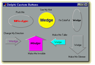
I just covered how to create a round button from scratch. You could have sub-classed the TSpeedButton control and overridden the paint method, but that wouldn't be any fun, would it? You can create a polygonal button the same way. Just define the points of the polygon as a function of width and height and use the CreatePolygonRgn method to create the region. The only other thing to do is to modify the MoveButton method to draw the button such that it -- well -- works like a button.
One thing you can also do is create a new type called TButtonDirection that has four button directions such as [btUp, btDown, btRight, btLeft]. Publish a new property of Direction. Next modify the paint method to call the DrawArrow method that checks the fDirection field and then in turn calls the DrawUpArrow method and so forth.
What a mouthful.
Then, you can create one component that has a multi-directional button on it. Be sure to check out the source that is on disk. Other buttons that I have created include a donut shaped button (think about this one!), a triangle, and a stopsign, with just a few modifications. Don't forget to check out the CreateRoundRectRgn function to draw bullet shaped buttons. This approach can also be easily modified to create LEDs, flashing lights, or any other graphical message you may want to send a user.
Enjoy!

 |
 |