Graph of the precession of the equinox
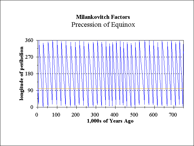
This graph shows the precession of the equinox
over the last 750,000 years. The precession is expressed as the
longitude of the perihelion from the vernal equinox.
The blue line traces the precession;
the orange line shows today's value for comparison. The data are from
Berger
and Loutre (1991).
 top of Why Glaciations? section
 Top of Ice Ages exhibit
 ISM Welcome Page.