Figure 4.1
One important requirement of many applications being developed is a GUI. GUIs are becoming commonplace in today's software products in an attempt to make software more "user-friendly." The VisualWorks environment provides many powerful and easy-to-use tools that make creating GUIs a relatively effortless and enjoyable task.
A GUI window is developed using the Canvas, Canvas Tool, and Palette. In order to create a functional GUI, there are several tools and techniques that must be learned. In the next few sections, you will learn how to select and alter widgets, set the size of the Canvas, and install the Canvas. All of these actions are important in the process of creating a GUI using VisualWorks. If you do not remember the basic ideas about these tools from Chapter 2, it may be helpful to review them before proceeding with this chapter.
 from the VisualWorks Launcher. Make sure that the Palette is in single selection mode by clicking on the single selection button
 . The input field for an operand or the result on the money calculator GUI is added to the Canvas as follows:
 from the Palette. The word "Input Field" should be displayed in the text area at the bottom of the Palette. Move the mouse pointer over the canvas. As you move the mouse pointer around on the canvas, an image of the selected widget will follow the pointer.
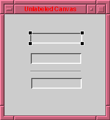
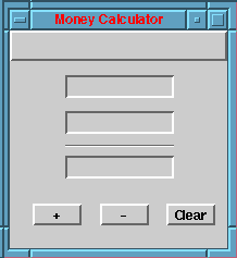
 from the Palette and place them on the Canvas as they are depicted in Figure 4.2. Follow the steps outlined above to select, place, resize, and move these widgets as needed.
 on the palette to allow the selection of one widget from the palette and then the placement of multiple widgets on the canvas. Select the action button
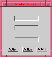
  from the Palette. Then, place the three action buttons on the Canvas as depicted in Figure 4.3. Simply click to place the first widget, then move the mouse and click to place the second widget. Repeat the same steps for the third widget. Return to single selection mode by clicking on the single selection button .
The Shift-Click technique allows you to select more than one widget on the Canvas at a time. To use the Shift-Click technique, simply select a widget by clicking on the widget, then hold down the Shift key and click on the other desired widgets. To deselect all the widgets, click on the background of the Canvas.
 on the Canvas Tool. The properties tool should look similar to Figure 4.4.
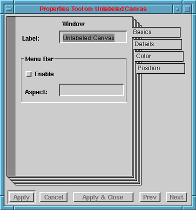
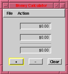
Next, we complete the steps that are needed to include a menu bar in a GUI window. Enable a menu bar by clicking on the Enable check box. In the Aspect input field enter "menuBar". Click Apply and a blank menu bar will appear on the Canvas. Creating a menu bar shifts the widgets on the Canvas down, so it may be necessary to move the widgets or resize the window so that all of the widgets are visible. If you resize the window, make sure to reset the interface size using the Layout->Window->Preferred Size option from the Canvas Tool menu. We have now added a menu bar to the GUI for our money calculator and given it the name "menuBar".
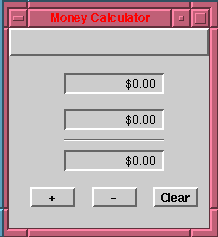
Now we will label our action buttons as needed for our money calculator. Select the left action button on the Canvas. The properties for that widget should be displayed in the Properties Tool window. Edit the Label field using the Properties Tool and change "Action" to "+". Click Apply and the changes should appear on the Canvas. Now select the middle action button on the Canvas. Edit the Label field in the Properties Tool and change "Action" to "-" and click Apply. Use the same procedure for the right action button, changing its label to "Clear". Click Apply and the Canvas should be similar to Figure 4.5.
Using the Properties Tool, set the properties listed in Table 4.6 for the three widgets.
| Tab | Property | Setting | |
|---|---|---|---|
| Input Field (Operand1) | Basics Basics Details | Type Format Align | Number $#,##0.00;[Red]($#,##0.00) Right |
| Input Field (Operand2) | Basics Basics Details | Type Format Align | Number $#,##0.00;[Red]($#,##0.00) Right |
| Input Field (Result) | Basics Basics Details Details Details | Type Format Align Can Tab Read Only | Number $#,##0.00;[Red]($#,##0.00) Right Off On |
After setting the properties for each of the three number field widgets, close the Properties Tool by selecting close from the Properties Tool [Window] menu with the right mouse button. The Canvas should now look like Figure 4.7.
Widgets can be aligned with other widgets by using the alignment buttons found on the Canvas Tool. There are alignment buttons for the following types of alignments.
 Top Align Top Align |
 Horizontal Center Horizontal Center |
 Bottom Align Bottom Align |
 Left Align Left Align |
 Vertical Center Vertical Center |
 Right Align Right Align |
The +, -, and Clear Action buttons should be grouped together. To accomplish this, first deselect all widgets by clicking on the background of the Canvas. Separate the three widgets by a distance that is pleasing to the eye. Resize one of the buttons to a preferred size for all three widgets. Leave the resized widget selected and select the other widgets by using the Shift-Click technique. All three widgets should now be selected. To match the buttons width and height click on the Equalize Height>  and Equalize Width
  buttons on the Canvas Tool. The three buttons should be of equal height and width.
With all three widgets still selected select the Arrange->Group option from the Canvas Tool menu. This will group the three widgets as one object so they can be moved without changing their relative position to each other. Now click the Bottom Align button to align the three widgets on a horizontal axis.
Next, deselect all widgets by clicking on the background of the Canvas. Select the three input field widgets using the Shift-Click technique and then equalize the height of the three widgets using the Equalize Height button . Now shift-click on the divider, so that the divider and all three input fields are selected. Equalize the width of all four widgets using the Equalize Width button . Now align all four widgets on a vertical axis by selecting the Left Align button .
Now we want to group the four widgets together by selecting the Arrange->Group option from the Canvas Tool menu. With the four widgets still selected as one group, move the group to a desirable location. Then select the group of action buttons using the Shift-Click technique. Finally, select the Vertical Center button to center the group of action buttons under the input fields. The main window should now look much more polished.
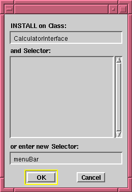
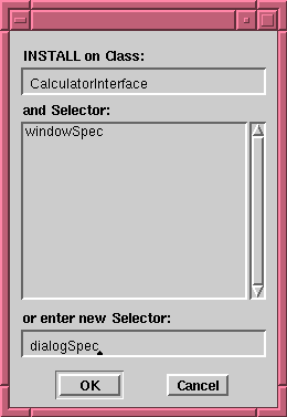
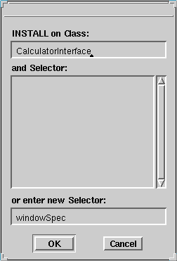
We choose to call the class for our interface "CalculatorInterface", and the main calculator window will be designated by a resource selector named "windowSpec" (the default). Click Install... on the Canvas Tool. A Dialog Window will appear and prompt you for a class to install on. Enter "CalculatorInterface" into the INSTALL on Class field. Make sure that the or enter new Selector field contains the name "windowSpec". The dialog should look like Figure 4.8; if so click, OK.
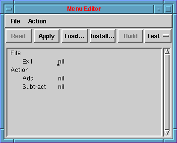
Make sure that all widgets on the Canvas are deselected. From the Canvas Tool, select Tools->Menu Editor. A blank Menu Editor should appear. Fill in the Menu Editor with the text as it appears below. Make sure that a leading tab precedes each menu item and that one or more tabs separate each menu item and the word "nil" that follows it.
File
	Exit		nil
Action
	Add		nil
	Subtract	nil
This code specifies that our menu bar will have two menus, "File" and "Action". The File menu will contain only one item, "Exit", and the Action menu will contain two items, "Add" and "Subtract". Exit will be used to exit (close) the calculator, and Add and Subtract will be equivalent to the + and - action buttons, respectively. The use of "nil" here is temporary, and each "nil" will be replaced later by the names of actions (methods) that are to be invoked when the menu action is selected during an execution of the money calculator application.
Click on Build to generate code for creating a menu bar object. A test bar will appear at the top of the Menu Editor. Test the menu bar to make sure all of the menu titles and items are correct. If any corrections are necessary, correct the errors in the Menu Editor and click Build again. Once you have built the menu bar, the Menu Editor should resemble Figure 4.10.